


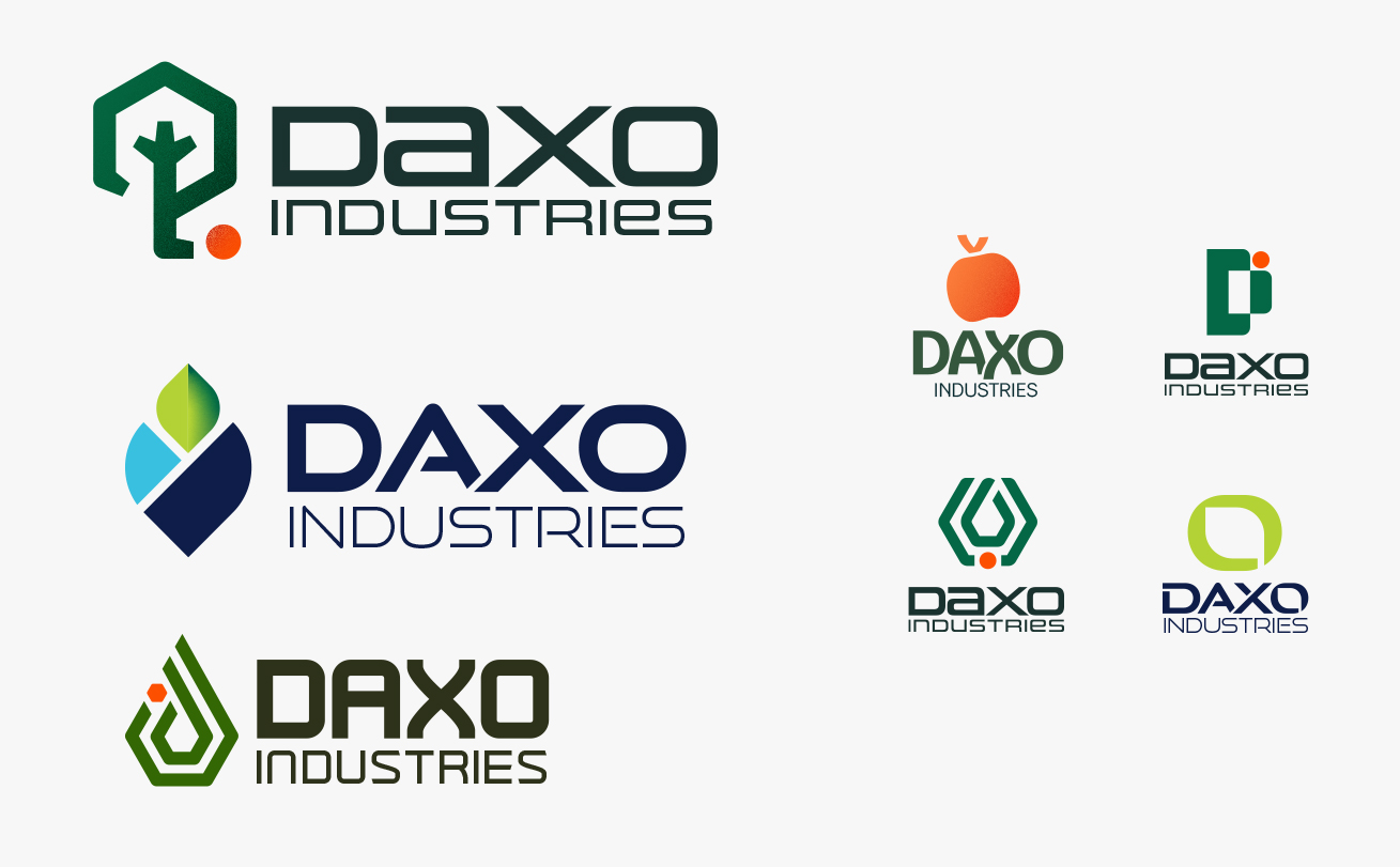
The original Daxo Industries logo was created by their founder and was the foundation of their beginnings as a start-up. Though they were ready to evolve, they didn't want to entirely deviate from the niche they'd charged out for themselves. After speaking with them in depth and doing a deep-dive into their competitors and audience — ranging from small orchards to large farms with detailed supply chains they're looking to streamline — a first round of proposed concepts was presented. These concepts focused more on the logomark with a supporting, simple wordmark.
Ultimately, the Daxo team decided that they liked the more geometric logos, but wanted them to be much more simplified. They wanted to maintain the wordmark style and have the logomark worked into the company name. They were drawn to hexagonal shapes and liked that direction, so after some collaboration with the stakeholders on the project, a new and approved logo option was presented

The final logo design was then applied to a series of stationary — like business cards, letterhead, notebooks — and apparel for the team to wear to trade shows, give to customers, and use when traveling.
Design elements like photography — which utilizes a mix of candid, everyday photos of orchards and the apple supply chain, and detailed macro photography of fruit and their products — and a pattern designed to mimic the production line in a packhouse as well as the circuitry on a mircochip were combined the round out the brand and bring it to life.


